
Responsive Design in the Era of Smart Devices: Best Practices and Strategies
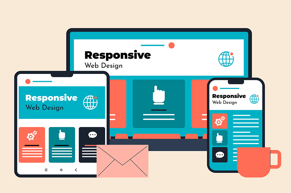
In the digital age, where smart devices of varying screen sizes dominate our daily lives, the importance of responsive web design cannot be overstated. Responsive design ensures that a website’s layout and content adapt seamlessly across different devices, providing an optimal viewing experience for users. Here, we explore best practices and strategies for implementing responsive design effectively.
Understanding the Need for Responsiveness
The proliferation of smart devices, from smartphones to tablets, has changed the way users interact with websites. A one-size-fits-all approach no longer works; websites must be adaptable to different screen sizes to ensure a user-friendly experience. This adaptability not only enhances user engagement but also contributes to better search engine rankings.
Fluid Grids: The Backbone of Responsiveness
Fluid grids are a cornerstone of responsive design. They use relative units like percentages, rather than fixed units like pixels, to define web page elements. This flexibility ensures that layouts stretch or shrink dynamically to fit the screen they’re displayed on. By adopting fluid grids, developers can create a consistent experience across devices.
Flexible Images and Media
Just like fluid grids, images and media need to be flexible. Use CSS to ensure images scale correctly within their containing elements. The max-width: 100%; property is essential, as it prevents images from exceeding the width of their containers, thus avoiding layout overflow issues on smaller screens.
Media Queries: Fine-Tuning Your Design
Media queries are a powerful tool in responsive design, allowing you to apply CSS styles based on device characteristics like width, height, and orientation. By using media queries, you can tailor your website’s appearance and layout to different devices, ensuring that your site looks great whether it’s viewed on a phone, tablet, or desktop.
Prioritizing Content for Mobile Users
Mobile-first design is a strategy where designers first create a version of a website for mobile devices, and then scale up designs for larger screens. This approach prioritizes content and functionality for mobile users, who often have different needs and constraints compared to desktop users.
Testing Across Devices and Browsers
Responsive design requires rigorous testing to ensure compatibility across various devices and browsers. Utilize tools and platforms that simulate different devices and screen sizes. Pay attention to touch interfaces, scrolling behavior, and loading times, which can vary significantly between devices.
Performance Optimization
A responsive site must not only look good but also perform well, especially on mobile devices where network speeds can be slower. Optimize images, minify CSS and JavaScript, and leverage techniques like lazy loading to improve loading times and overall performance.
Accessibility Considerations
Responsive design also overlaps with web accessibility. Ensure that your site is navigable and readable on all devices. This includes readable font sizes, clear navigation menus, and ensuring that interactive elements are easily clickable on touch devices.
Embracing Future Trends
Stay informed about emerging technologies and trends in web development. For instance, the increasing use of AI and voice search can impact how responsive sites are designed and structured. Keeping abreast of these trends will ensure that your website remains relevant and user-friendly.
Conclusion
Responsive design is no longer optional; it’s a necessity in the era of smart devices. By following these best practices and strategies, you can create websites that offer seamless and engaging user experiences, regardless of the device used. Remember, a responsive website is a gateway to reaching a wider audience in our increasingly mobile world.