
Adaptive Design vs. Responsive Design: Which is Better?
With the diversity of devices in today’s world, building a website that performs well on screens of all shapes and sizes is essential. This is where the debate between responsive design and adaptive design comes into play. Both methods aim to optimize the user experience across devices, but they take different approaches. Understanding the differences and benefits of each can help you make the right decision for your project. Let’s dive into what sets them apart, the pros and cons of each, and when to use one over the other.
Understanding Responsive Design
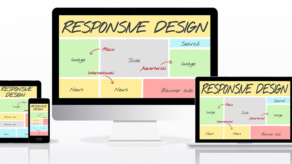
Responsive design is a method that uses flexible grids, fluid images, and media queries to automatically adjust a website’s layout to fit the screen size. Rather than creating different versions of a site for each device, a responsive design ensures that one version of a site rearranges and resizes elements based on the viewport.
A common technique in responsive design is the use of CSS media queries, which allow developers to set breakpoints where the design should adapt based on screen width. For instance, a three-column layout on a desktop might turn into a single-column layout on a mobile phone.
Pros:
- Simplicity: Since only one codebase is used, maintenance is often easier, and updates apply universally across all devices.
- SEO-Friendly: Google favors mobile-friendly, responsive designs in search rankings, improving your site’s SEO.
- Consistent User Experience: Users get a cohesive experience across all devices, as content and design elements adjust seamlessly.
Cons:
- Performance Issues: Responsive design can sometimes lead to slower load times if elements that aren’t needed on smaller screens are still loaded.
- Design Limitations: Responsive design may not offer as much control over how the site appears on each device, limiting customizability for device-specific needs.
Understanding Adaptive Design
Adaptive design takes a different approach by creating multiple layouts tailored to specific screen widths. An adaptive site detects the device type and loads a pre-designed layout suited for that screen. Typically, adaptive sites are designed around a few common breakpoints, like 320px (for small screens), 768px (tablets), and 1024px (desktops).
Provides greater control over each layout because you’re designing for a specific set of screen sizes. It’s essentially a “design for device” approach, where each layout version is optimized for a particular set of devices or resolutions.
Pros:
- Device-Specific Optimization: Adaptive design can offer a tailored experience optimized for each device, often leading to faster loading times.
- Greater Control Over Design: Designers can customize the layout and user interface for specific devices, ensuring a consistent and optimized look.
- Performance: Since adaptive designs often load only the necessary resources for each layout, they tend to be faster on mobile devices.
Cons:
- Complexity and Maintenance: With multiple layouts, maintenance can be time-consuming. Any updates or changes need to be made across each layout.
- Limited Flexibility: Adaptive design is limited to predefined breakpoints, which may not work as well on uncommon screen sizes.
Key Differences Between Responsive and Adaptive Design
- Layout Flexibility: Responsive design is fluid and adjusts to fit any screen size, while adaptive design loads a layout based on specific breakpoints.
- Development Complexity: Responsive design typically requires one codebase, while adaptive design may need separate layouts for each device, increasing maintenance.
- Performance: Adaptive design often results in faster loading on mobile devices since it loads device-specific resources, while responsive sites can be slower due to loading resources for all screen sizes.
When to Use Responsive Design
Responsive design is often the better choice for most websites due to its simplicity, cost-effectiveness, and SEO benefits. For blogs, e-commerce sites, and informational websites where content consistency across devices is important, responsive design is ideal. Since responsive design scales to any screen size, it future-proofs the site against new devices.
Responsive Design is Ideal For:
- Websites with a broad audience across various devices.
- Projects with limited budgets or resources for ongoing maintenance.
- Content-driven sites that don’t require heavy customization on different devices.
When to Use Adaptive Design
Adaptive design shines in scenarios where a tailored experience for different devices is essential. For example, if a site has a high volume of mobile traffic or if performance optimization is critical, adaptive design can help create a seamless, fast experience for mobile users. Adaptive design is also useful in web applications where the interface may need to differ significantly across devices for usability.
Adaptive Design is Ideal For:
- High-traffic sites where mobile performance is critical.
- Websites with custom UI requirements across devices, such as complex web applications.
- Scenarios where budget and resources are available for maintaining multiple layouts.
Which is Better: Responsive or Adaptive?
There’s no one-size-fits-all answer, as the choice depends on your project’s needs, goals, and resources. For most general-purpose websites, responsive design is the preferred option because of its flexibility, simplicity, and alignment with modern SEO practices. However, if you’re developing a highly interactive web application with distinct user experiences across devices, adaptive design might be a better choice.
The Hybrid Approach
Sometimes, the best approach is a combination of both responsive and adaptive elements. For example, you might create a primarily responsive design but use adaptive elements for specific device breakpoints where you need more control. This hybrid approach can offer a balance between flexibility and customization, ensuring a smooth user experience.
Final Thoughts
Choosing between responsive and adaptive design boils down to understanding your audience, prioritizing user experience, and balancing development resources. By taking into account your project’s goals, you can create a website that looks great and performs well across any device.
Both approaches have their advantages, and with the right planning, you can create a site that users will love, no matter how they access it.